Origin Story
At Mediatonic we have PDT (Personal Development Time), where we’re actively encouraged (as it says on the tin) to develop our skills, be that learning new software, testing out new techniques, or simply working on personal projects to develop skills in a certain area. I wanted to use this time to bring people together as a group to work on a collaborative project and thought Momentum’s hospital mural project would be a great fit!
Working locally in South West London, Surrey and Sussex, they support families whose children have cancer or a life-challenging condition. They offer tailored practical and emotional help to the entire family, through a unique support programme both at home and in hospital, which includes therapy services, counselling, holidays, experiences and children’s ward refurbishments.

Hospital renovation and improving the healing environment is one of the core principles of the charity's work—they aim to make hospital visits less intimidating for small children.
While I’ve worked on a variety of room projects for Momentum Children’s Charity over the years, I've actually been personally connected with Momentum since their inception in 2004 when I was diagnosed with stage three non-Hodgkin's lymphoma at the age of thirteen. This was a particularly intimidating time for me as my mother had passed away from cancer when I was just six, which was obviously a hugely overbearing stress on not just me, but also my family. My illness meant I missed out on a lot of life experiences as I underwent treatment for two-and-a-half years, but Momentum helped me out a great deal when I was ill and I always wanted to give something back.
They were only a small charity back then and I was one of the first patients that they helped. I'd be kept in isolation rooms for up to two weeks at a time during some of the more intense stretches of chemotherapy, due to my immune system just being too weak to deal with anything other than a clinically sterile environment. They bought a PlayStation for the room, as well as a load of games, books, DVDs and drawing materials to keep me entertained.
Obviously cancer isn’t fun, but they did what they could to make my stay in hospital a better experience. Since getting better I've been a supporter of their cause and have done many fundraising challenges for them including: cycling the length of the UK, an Ironman Triathlon and a Solo Channel Swim (although I do recommend the ferry, it's a lot more pleasant). On the art side I've been involved in a large amount of their hospital projects: rooms themed around the circus, pirate adventures, the books of Jacqueline Wilson, and a number of woodland owl rooms based on their charity mascot.
The Process
Momentum have a wishlist of rooms that need attention, and we settled on an oncology washroom at St Peter's Hospital. It’s a purpose built room used by children undergoing chemotherapy, and unlike an isolation room, it’s more general purpose and so we’d have the opportunity to make an impact on even more children.
The existing themes on the ward are largely nautical, featuring pirates and tropical islands etc., so we decided that an underwater coral theme would be a great fit and allow us to really push colours to create something vibrant.
Here's what the room looks like as of November 2018:

In mid-November 2018 I pitched the project team and the volunteers started rolling in. Every single member of the team brought something valuable—be it a suggestion of a colour palette, a rendering or illustration style or constructive feedback on the artwork that we were making and the project may have looked very different had we not had all of their input.

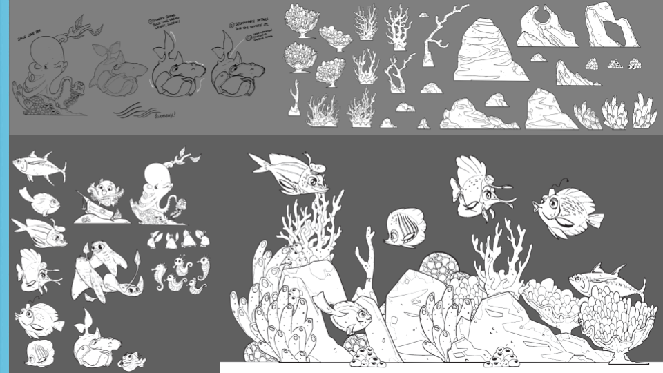
We explored funny fish shapes, small underwater scenes, interesting coral formations, amusing fish puns (brill-iant ones that are eely funny), it was all about getting a wide range of visual talking points for us to discuss and iterate upon.

You'd be surprised how much planning goes into designing a wall mural, especially when game developers are behind it. People divided and conquered, some creating characters and little narrative scenes, while others focused on lush rock and coral formations bursting with colour. Selecting designs and unifying everything under a house style produced a lot of discussion, but from previous experience I was able to steer us towards a style that would work best on a technical level.

There are also many considerations to make when producing vector graphics for large scale printing. We used Kate's sketches to create a final "benchmark" version that incorporated the best parts of everyone's style exploration as well as something that would translate faithfully to print. These constraints were great growing moments for the team, with a few of the 2D animation specialists adding helpful critique to help other artists better gauge how colour and shape worked in the space.

Prepping our design for the space itself was hugely technical. By using reference photos and a scale wire diagram we received from the mural installers, we had basically a 2D unfolded map of the room. The prep for this mock up phase was where our real tech expertise as game designers came in. Our 3D artist Antoine created a mock up of the room, which our tech artist Dan Ocean (aptly named) turned into an interactive mock-up, giving us the ability to preview it on our phones as a 3D model!

So we had a fantastic tool to show off our design idea to Momentum, and let us give them a great idea of what the room would look like finished.


We had a very positive response from Momentum and St Peter’s Hospital before both of our offices closed for the Christmas break, and the official signoff to carry on as planned once we got back (with no changes! That never happens!).
From there, everything got a shadow and highlight pass, which helps the whole scene look more dimensional and less like flat wallpaper. It's a pretty technical process to make sure everything would align properly when printed. Special thanks to Amy, Sophie, Kate, Naim and Jing who really got to grips with my seemingly odd requests for how I was asking them to align all the layers, and managed to plough through all of the assets.


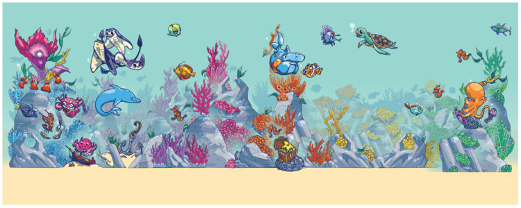
Based then on the mock image that we'd done for Momentum's approval it was then a relatively simple case of taking out the images in the mock and replacing them with the full colour versions from the asset sheets. Amy had a wonderful suggestion to shift the hue of the coral as it went around the room, so the final effect is very rainbow like (we do love a good rainbow here at Mediatonic).

We made some final tweaks to exaggerate environmental depth and density. Part of the fun of these rooms is seeing something new every time you go in them and that was definitely a consideration with how everything was placed across a variety of heights from floor to ceiling.

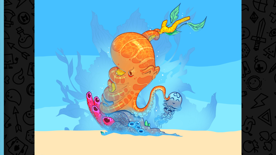
The final room artwork is shown above, including a room wire diagram overlay. You can also see the call out images of a baby Kraken, a dolphin hidden behind the fold-down baby changing unit, a fish and a turtle talking about sea life, the tickling octopus and a starfish enjoying its treasure.

Momentum were delighted with our final design and 3D mock up, asking for no alterations (it happened again!), so the files were prepped for print and sent off to Fastsigns Kingston. They printed the design onto vinyl adhesive wallpaper, which works great because it’s very vibrant, and importantly in a hospital, can be wiped clean. The wallpaper is cut into drop sections corresponding to the wire diagram measurements and then put up from rolls in more or less the same way regular wallpaper is handled. And with that our work on the room was finished!
The Reveal
By mid-February we had the photos through from Momentum and Fastsigns that the installation had gone ahead and our artwork was a part of the hospital! So (at last) here are those AFTER photos:


While we were there, we met with Sue Snaith, a Paediatric Oncology Nurse Specialist, who relayed some of the comments that the children had been making about the room - like how they were excited to go in there, and that every time they went in they always saw something new.
She said she looked forward to pointing children into the room who had last seen it in its “before” state, and then watching their faces light up when they opened the door. It was tremendous for everyone to hear directly about what a positive impact that the room had already made and it drove home why we embarked on this project in the first place.
This was a hugely collaborative project within the studio and was something immensely rewarding to work on. It's not just that it was something that brought artists from different teams in the studio together, but rather an opportunity to work on something that truly gives back. The team effort required to push this to the highest standards has really made me proud of everyone involved and I'm really happy that it was an experience that I could share with them.
Hospitals are an intimidating place, especially for young children who don't understand why they're there, and it’s a really important aspect of Momentum's work to enhance the healing environment. Of all of the projects that I've worked on with Momentum, this is a real standout one for me. Any parent who has had a child in hospital will tell you what an enormous difference efforts like this make: at those tough moments, finding something to interest your child—even for a few minutes—can be enough to distract them from their pain and upset, and that shift in mood can have a lasting effect.
Get Involved
So to wrap up then - if Momentum's cause has got your interest then you can find out more about them on their website:
https://www.moment-um.org/home/
And if you'd like to see more of the work that they've done in hospitals then you can see a really large variety of rooms that they've made happen here:
https://www.moment-um.org/how-we-help/hospital-refurbishments/
And if you think that sounds great and you'd like to do a bit of fundraising for them yourself then you can find out ways and ideas of doing that here:
https://www.moment-um.org/get-involved/
Check Out Our Artists!
Everyone worked so hard at this that it seems unfair not to make any artist call outs for great work both in the development of, and in, the final image:
- Amy Pearson - for the guidance on colour and line art as well as such emotive characters
- Antoine Dekerle - for the 3D model for the mock
- Daniel Ocean - for bringing that 3D model to life with our artwork in the preview tool
- Daniel Hoang - for the style sketch that set the tone for the colour palette
- Gina Nelson - for the sketches and guidance during the early stages
- Gregor Kari - for really pushing the shapes on those fantastically wacky hat wearing fish
- Jing Tan - for all the seahorses and the hiding dolphin, as well as those (sadly unused) amazing mermaid illustrations
- Kate Price - for all the fantastic narrative sketches, especially the tickling octopus
- Naim Simeon - for those great "hospital fish" images, colour and texture exploration as well as making all those rocks look so solid
- Sam Geussens - for exploring the atlantis approach and style contribution in the early stages
- Sophie North - for the amazing artwork of all those little narratives, especially the shy hammerhead and the clown fish
- ...oh, and me! Tudor Morris
And a general well done to everyone involved for being able to work in a way that matched the style image so well that it looks like one artist made the whole piece, as well as the effort and intuition put towards conversations, feedback and a really positive bouncing around of ideas.


